In the original,
uncropped image of Heidi
Klum the photographer chose to take a vertical picture in order to capture the super model's pregnant belly. The photographer made a conscious effort to take a full-body picture of
Klum because he/she was aware that the public would be interested in seeing that she was pregnant and still glamorous. Also, when this photo is cropped before you see
Klum's stomach there is really no
punctum or emotional element to this photo, as discussed in
The Practices of Looking. The person who chose this picture cropped it in such a way as to include the informational element of telling the viewers that Heidi
Klum was pregnant. There is certainly an emotion
elicited when seeing a beautiful pregnant woman; opposed to simply seeing her upper half; the cropped version doesn't give the viewer anything unique to think or feel.

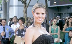
 In the original, uncropped image of Heidi Klum the photographer chose to take a vertical picture in order to capture the super model's pregnant belly. The photographer made a conscious effort to take a full-body picture of Klum because he/she was aware that the public would be interested in seeing that she was pregnant and still glamorous. Also, when this photo is cropped before you see Klum's stomach there is really no punctum or emotional element to this photo, as discussed in The Practices of Looking. The person who chose this picture cropped it in such a way as to include the informational element of telling the viewers that Heidi Klum was pregnant. There is certainly an emotion elicited when seeing a beautiful pregnant woman; opposed to simply seeing her upper half; the cropped version doesn't give the viewer anything unique to think or feel.


